
How to Choose Colors for Abstract Wall Art
Color is the first thing a room notices about a painting, and often the last thing people decide with any method. They pick a canvas because it looked lively on a screen, then discover it fights the sofa, the floor, or the afternoon light. Abstract Wall Art makes that mistake more expensive, because extra-large fields do not hide. A small print can be wrong quietly. A six-foot abstract is wrong in public.
This guide is a color method for handmade abstracts. It starts with the room you already have—walls, furniture, light—then uses color theory as a tool, not as a costume.
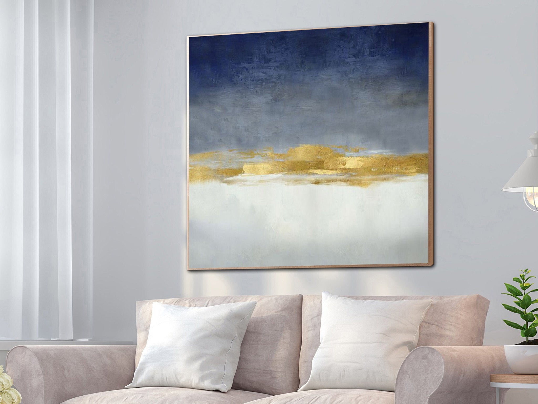
Start With the Room, Not the Wheel
An abstract painting does not have to match a pillow. It does have to belong to the same climate as the materials around it.
List the large surfaces first: wall paint, sofa, rug, floor, curtains. Those five things already occupy most of the visual field. The canvas should either continue that climate or supply one clear contrast. If the room is oak, linen, and warm white, a neon triad will look imported. If the room is charcoal, stone, and black metal, a pale blush field can look unfinished unless it has enough mass and a cooler neighbor.
Light changes every list. North light is cooler and makes yellows look weaker. West light warms whites and can push blue toward ink. Test a color sample on the actual wall at noon and at night. A navy-and-gold abstract that looks calm under daylight can read as heavy under warm bulbs.
Abstract art makes this test stricter than a landscape would. There is no tree or horizon to explain the hue. The color is the subject. If the temperature is wrong, the painting has nothing else to hide behind.
Three Reliable Palettes
Most successful living-room abstracts fall into one of three families.
Neutral fields
Cream, sand, stone, plaster, warm gray, soft taupe. These works quiet a wall. They are not empty if the surface is real—knife ridges, stained grounds, a shift from warm white to clay. Neutral fields sit easily with oak, linen, boucle, and pale sofas. They fail when they are both pale and small. A quiet color needs area.
Tonal palettes
One family of hues in several values: blue to slate to white; rust to sand to ivory; green-gray to fog. Tonal paintings feel considered because they already contain their own contrast. They work in rooms that already have a dominant material color.
Contrast palettes
A deep field with a metallic or complementary accent: navy and gold, black and cream, teal and warm sand. Contrast is useful when the furniture is simple and the wall needs a focal point. It is risky when the room already has several loud objects.
Color harmony describes why these families work. Analogous hues sit next to each other on the wheel and stay calm. Complementary colors sit opposite each other and raise contrast. In a house, complementary pairs should usually be unequal. Let one color occupy most of the canvas. Let the opposite color appear as a seam, a leaf, or a late mark. Equal amounts of orange and blue often cancel each other into noise.
How Color Field Thinking Helps at Home
Mid-century painters treated large areas of hue as enough content. The Tate’s note on colour field painting is a clear museum account: broad, relatively flat areas of color, without a required story. You do not need a Rothko to use the lesson. A living-room abstract can be a climate—mist, clay, deep water, warm plaster—rather than a collection of competing incidents.
Tate’s Colour Coursework Guide is also useful because it separates descriptive color from expressive color. In a portrait, red might be a coat. In an abstract, red is temperature and weight. Decide which job you want the hue to do before you fall for a busy thumbnail.
Match Color to Furniture Temperature
Warm sofas—camel, rust, cream, cognac—sit with earth, ochre, olive, and soft gold. Cool sofas—gray, blue-gray, ink, white with a blue cast—sit with slate, navy, plaster, and muted teal.
A white sofa is not a free pass for every palette. Warm white wants sand and blush. Cool white wants blue-gray and ink. If you put a peach field over a blue-white sofa, the sofa will look dirty or the painting will look cosmetic.
Dark sofas need either contrast or mass. A mid-beige abstract can vanish over charcoal velvet. Navy, rust, black-and-cream, or a large gold-on-white field has enough weight to meet the furniture.
Wood tone matters as much as upholstery. Honey oak pushes a canvas warmer. Walnut can take both earth and deep blue. Pale ash wants quieter grounds so the painting does not look yellowed.
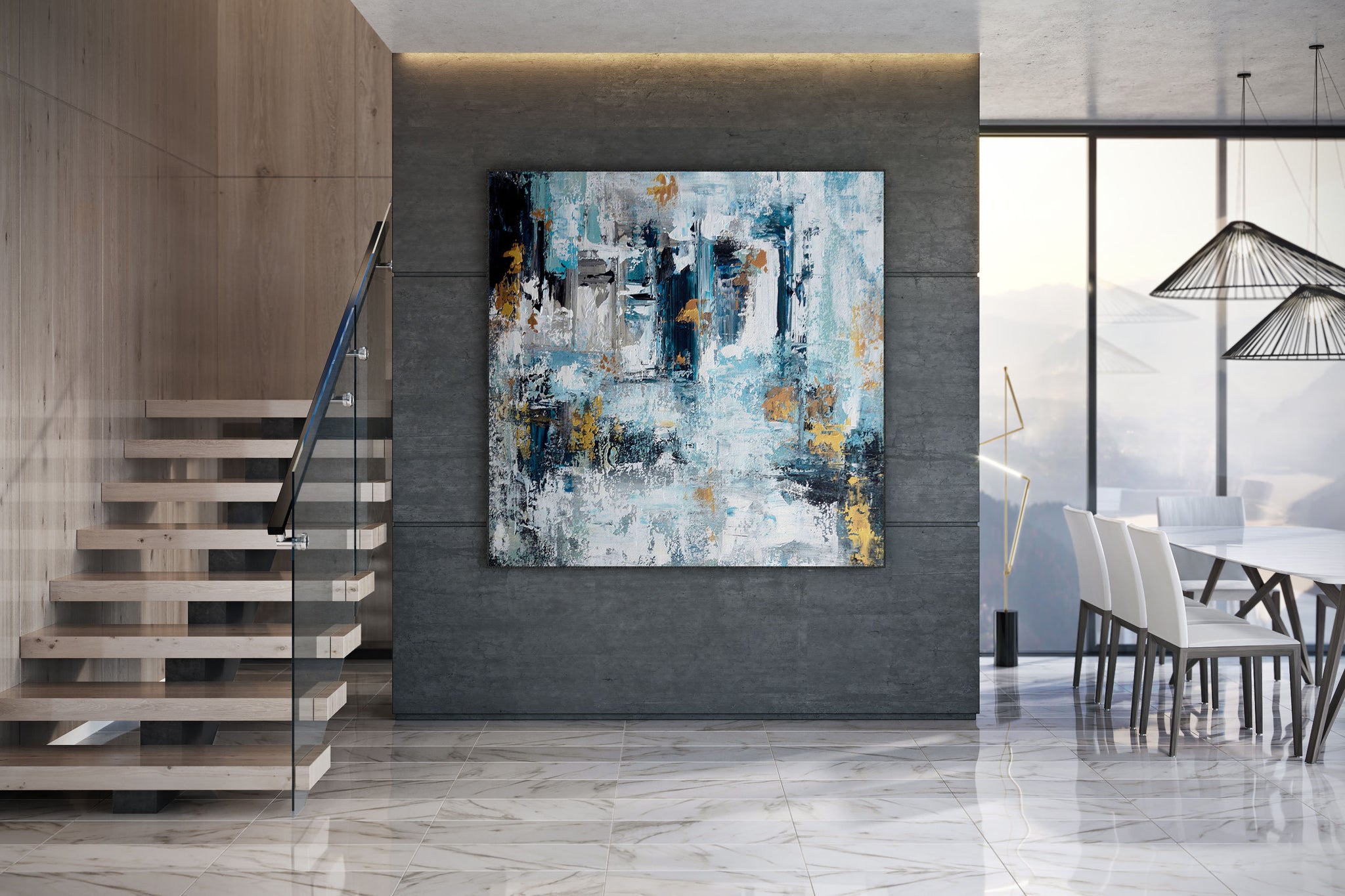
The 60–30–10 Check
Designers often divide a room into a dominant color, a secondary color, and an accent. Use that as a check for the painting.
If the room is already 60 percent warm white and 30 percent oak, the canvas can be the 10 percent accent—or it can stay inside the 60 and add only a quiet shift. If the room has no accent at all, a navy-and-gold abstract can supply it. If the room already has brass lamps, rust cushions, and a patterned rug, the painting should usually simplify, not add a fourth loud hue.
Count colors in the canvas the same way. One dominant ground, one supporting value, one accent. Extra-large abstracts with five competing hues rarely settle a sofa wall.
Light, Sheen, and Metallic Color
Color is not only hue. Sheen changes it.
Matte grounds absorb light and look calmer on camera and in bright rooms. Satin and metallic leaf bounce light. Gold leaf next to a window can flare at 4 p.m. and look rich at 8 p.m. If the wall gets direct sun, keep metallics as a band or a mark, not as the entire field.
Blue is especially sensitive to light. A navy that looks architectural at noon can go black under dim lamps. If you want blue to stay blue in the evening, keep some mid-value gray or white inside the field so the hue has a neighbor.
Texture also changes color. The same beige reads warmer when the ridges catch side light. That is useful in rooms that would otherwise feel flat. It is a problem if you chose beige to disappear and the impasto then turns the wall into a topographic map.
Room by Room
Living rooms can take a stronger field. The painting has to work from the doorway and from the sofa. Contrast palettes and large tonal fields both succeed if the scale is right.
Bedrooms usually need mid values. High-chroma reds and sharp complementary pairs keep the wall awake. Soft tonal abstracts and warm neutrals are easier to live with.
Dining rooms tolerate more saturation because people occupy them for shorter stretches. A warmer field can help evening light.
Offices need colors that will not dominate a camera. Avoid large areas of high-gloss gold and neon. Slate, plaster, and muted blue are safer.
A Practical Sequence
- Photograph the wall with the sofa and floor in the frame, in daylight and at night.
- Name the room’s temperature: warm, cool, or mixed.
- Decide whether the painting should continue that temperature or supply one contrast.
- Choose a family: neutral, tonal, or contrast.
- Limit the canvas to three roles—ground, support, accent.
- Check the sample against wood, metal, and fabric, not only against the wall paint.
- If you are ordering Abstract Wall Art, send those photos with the color note. A maker can shift a navy warmer or a beige cooler. A maker cannot guess your west-facing window.
Do not choose color from a crop of the painting alone. Judge it in a room shot. Extra-large color is a climate. Crops lie.
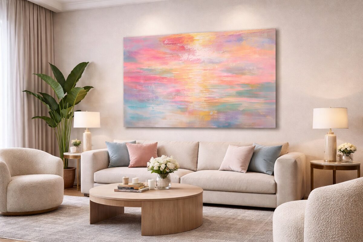
Common Color Mistakes
Matching the painting exactly to a throw pillow. The pillow will change; the canvas will not.
Choosing the brightest object on the site instead of the quietest object that still holds the wall.
Using equal complementary blocks.
Ignoring bulb color. Warm LEDs will shift every sample.
Putting a cool gray abstract on a yellow-beige wall and blaming the painter.
Buying a pale field that is also low-contrast and undersized. Quiet color needs scale.
Conclusion
Choosing colors for abstract wall art is a room problem first and a wheel problem second. Read the furniture and the light. Decide whether the canvas should belong to that climate or punctuate it. Keep one ground, one supporting value, and one accent. Then give the field enough size to act like architecture.
A well-chosen abstract does not explain itself. It makes the sofa, the floor, and the daylight look as if they had been waiting for that temperature.
FAQ
How do I choose colors for Abstract Wall Art?
Start with wall, sofa, floor, and light. Decide whether the painting should continue that climate or add one contrast. Then limit the canvas to a ground, a support, and an accent.
Should the painting match the sofa?
It should agree with the sofa’s temperature. Exact matching often looks staged and dates quickly.
What colors work best in a living room?
Neutral fields, tonal blues or earths, and one-contrast palettes such as navy and gold. Avoid five competing hues on one extra-large canvas.
Do complementary colors work above a sofa?
Yes, if they are unequal. Let one hue dominate. Use the complement as a seam or accent.
What if my room is already colorful?
Choose a quieter field that borrows one existing hue rather than introducing a new loud one.
How does lighting change abstract color?
West light warms whites and golds. North light cools yellows. Warm bulbs can turn navy black and beige yellow.
Are neutral abstracts boring?
Not at extra-large scale with real surface. Quiet color needs area and texture to hold a wall.
Where can I read more about color without shopping?
See color theory, color harmony, Tate on colour field painting, and Tate’s Colour Coursework Guide.
Can I ask for a color adjustment on a handmade canvas?
Usually yes, if you send room photos and name the problem—too warm, too cool, too dark at night.
Where can I browse extra-large abstracts by palette?
Abstract Wall Art collects handmade oversized canvases across neutral, tonal, and contrast palettes that can be matched to the room you already have.