
What Is Texture Art? Actual Texture vs Visual Texture Explained
Texture is one of the oldest tools in visual art, and one of the easiest to misunderstand. People use “Texture Art” to describe almost anything with a rough look: a plaster canvas, a palette-knife abstract, a photograph of bark, even a flat print that merely imitates ridges. Those examples are not the same thing. Some have a surface you could feel with your fingertips. Others only look that way.
That difference—between actual texture and visual texture—is the key to reading a painting, hanging it well, and not confusing a raised surface with a printed one.
In the visual arts, texture is the perceived surface quality of a work. It belongs with line, color, shape, value, form, and space as a basic element. Wikipedia splits it into two practical categories: physical texture, also called actual or tactile texture, and visual texture, also called implied texture. One exists in relief. The other exists as an optical effect.
Texture as an Element, Not a Style
Texture is not a movement. It is a property. A still life can have it. A portrait can have it. A completely abstract canvas can have it. When contemporary interiors talk about texture art, they usually mean a painting whose surface is part of the image: ridges, peaks, scraped valleys, built plaster, or layered paste that catches light.
Tate’s coursework guide on texture treats the subject across media, not only paint. Weaving, embroidery, fiber sculpture, and thick oil all count because they change how a surface meets the eye and, sometimes, the hand. Anni Albers used woven structure to restore a sense of touch against slick industrial finish. Painters such as Frank Auerbach and Leon Kossoff built ridges so heavy that the paint itself became almost sculptural. Gestural drips and dense mark-making can also create the look of roughness without much physical height. The same word, two different operations.
That is why a definition that stops at “art with texture” is too loose. The useful question is whether the roughness is in the material or only in the depiction.
Actual Texture: When the Surface Is the Work
Actual texture is physical. The surface rises and falls. Light hits a peak and drops a small shadow into the next groove. If you were allowed to touch the painting, your fingers would confirm what your eyes already suspect.
In painting, the classic method is impasto: paint laid on thick enough that the stroke of the brush or knife remains visible. Tate notes that the word refers to “an area of thick paint or texture, in a painting.” The Italian root means dough or paste, which is a fair description of how the material behaves. Oil is the traditional medium because it stays plastic long enough to be piled, dragged, and carved. Heavy-body acrylic and modeling paste can produce a similar relief, though they dry faster and can shrink.
Wikipedia’s entry on impasto adds two purposes that still matter in a living room. First, thick paint reflects light differently from a thin, blended film. The artist gains control over highlights that are physical, not painted. Second, the mark records pressure and speed. A knife dragged through wet color leaves a different handwriting from a loaded brush stabbed into the canvas.
Actual texture is older than modern abstraction. Venetian painters such as Titian and Tintoretto used it to make fabric and flesh catch light. Rembrandt built it into jewelry and wrinkled skin. In the nineteenth century, Vincent van Gogh made the ridge of paint part of the image itself: a star is not only a yellow circle, but a raised coil that turns with the stroke.
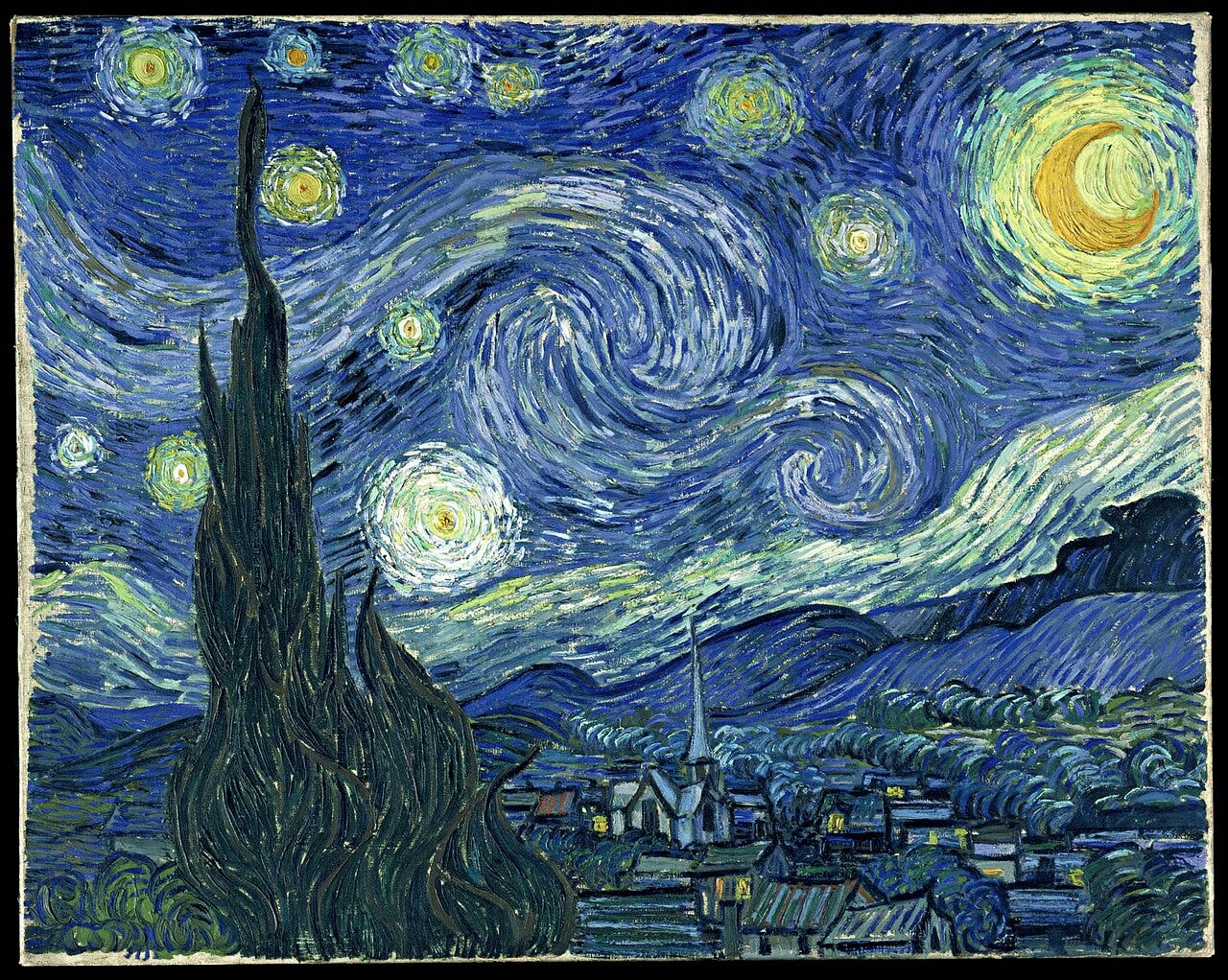
Van Gogh’s The Starry Night is often cited because the night sky is built from visible, physical strokes rather than a smooth illusion of atmosphere.
Twentieth-century painters pushed the same idea further. Tate points out that modern art increasingly treated the painting surface as a reality in its own right, not a transparent window onto another world. The texture of paint could carry feeling the way handwriting carries a voice. By mid-century, artists such as Auerbach, Dubuffet, and Kossoff piled material until some works approached relief sculpture. Matter painting, or haute pâte, made that emphasis explicit: the substance of the paint was the subject.
In contemporary wall work, actual texture usually comes from one or more of these methods:
- Palette-knife ridges and smears
- Brush impasto left standing
- Modeling paste or plaster built and then painted
- Mixed media that embeds sand, fiber, or other matter
- Scraped and incised layers that expose earlier color
The common test is simple. Move sideways. If the highlights travel and the shadows change, the texture is actual.
Visual Texture: When Roughness Is an Illusion
Visual texture, or implied texture, is the appearance of surface without the corresponding relief. A drawing of fur can look soft. A photograph of cracked earth can look abrasive. A smoothly primed canvas can be painted to resemble stone, water, or weathered wood. The hand would feel little of that roughness. The eye supplies it.
Artists create visual texture with hatching, stippling, broken color, dry brush, and careful contrast. A landscape painter may render bark so convincingly that viewers think of roughness even though the varnish is glassy. A digital print of an impasto painting is the everyday version of the same trick: the photograph records shadows that once belonged to real ridges, then flattens them onto paper or canvas.
Visual texture is not a lesser device. It is how most representational painting has always suggested materials. It is also how many affordable wall pieces imitate handmade relief. The problem is not the illusion. The problem is calling the illusion the same thing as the built surface.
Wikipedia notes that visual texture can be decorative, spontaneous, or mechanical. A repeating pattern can look woven. A photograph can look tactile. None of that requires a raised film of paint.
Why the Distinction Matters
The difference shows up in three places: light, scale, and photography.
Light. Actual texture needs raking light—light that comes across the surface rather than straight at it. Side windows, picture lights, and even a lamp at an angle will pick out ridges. Frontal, even light flattens them. Visual texture is less dependent on angle because the “shadows” are already painted or printed in place. They stay put when the sun moves.
Scale. A thin visual texture can work at any size. Actual texture becomes more persuasive as the painting grows. A two-centimeter ridge on a small panel can look fussy. The same ridge on a large canvas reads as structure. That is one reason extra-large handmade work and thick paint so often travel together.
Photography. A good photograph of impasto can look almost as rich as the object. That is useful for study and disastrous for shopping if the listing never clarifies whether the relief is real. A printed reproduction of Van Gogh has visual texture. The painting in the museum has actual texture. Both are worth looking at. They are not interchangeable on a wall.
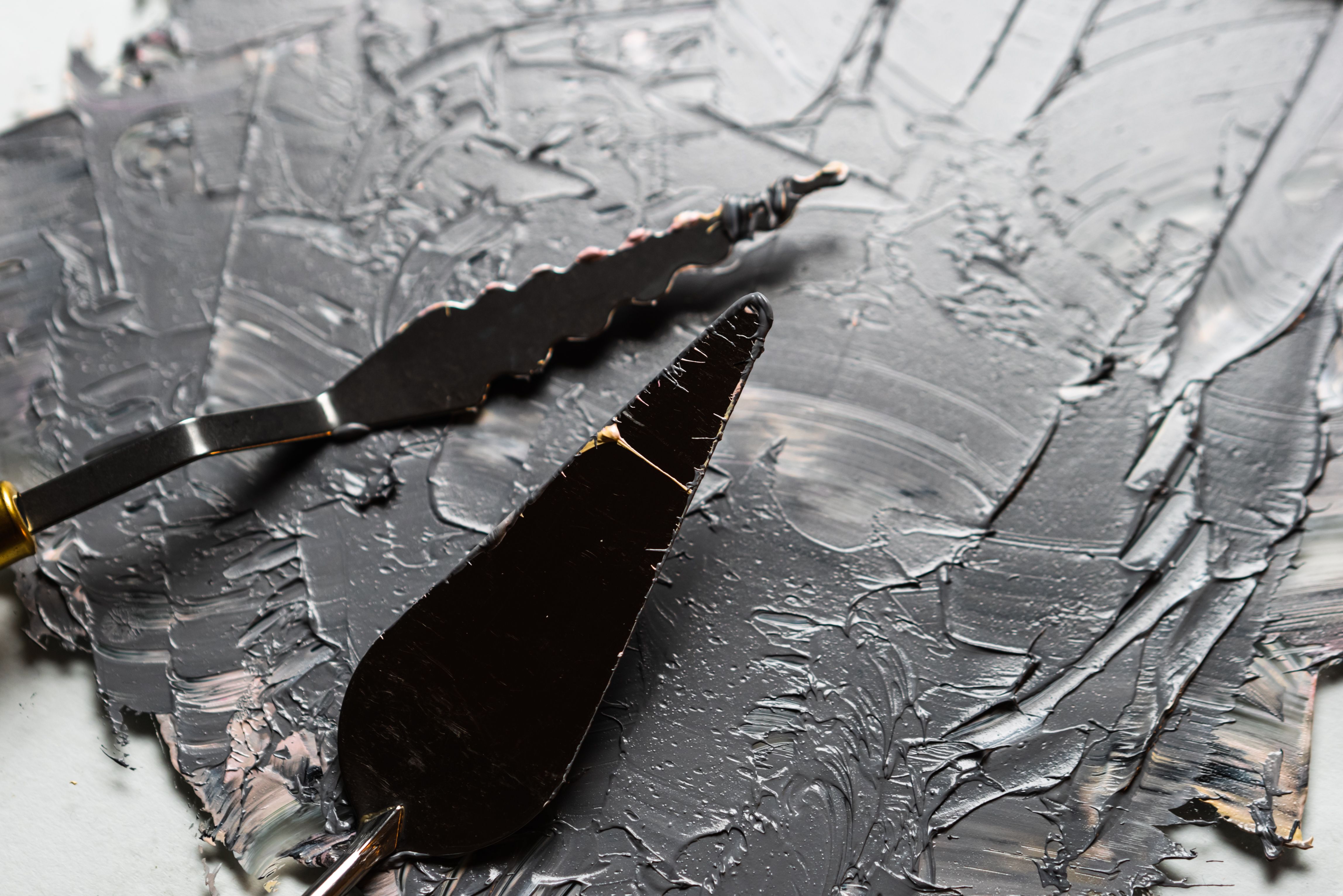
A palette knife leaves a physical track in thick paint. That track is actual texture; a photograph of it is only visual texture.
How Texture Art Uses Both at Once
Most successful texture art does not choose one category and abandon the other. A built surface still uses color, edge, and contrast. A knife mark is physical, but the way two colors sit side by side is visual. Van Gogh’s skies are both: the coil stands up, and the adjacent blues and yellows also look turbulent.
Contemporary abstract canvases often work the same way. Neutral plaster fields rely on actual relief because the color range is narrow; without height, the wall would go quiet. High-chroma knife paintings use both: the color does one job, the ridge does another. Smooth color-field painting, by contrast, may suppress actual texture almost entirely and still be abstract. Flatness can be a deliberate choice, not a defect.
Tate’s account of modern painting is useful here. Once artists decided that the surface should have its own reality, texture stopped being only a way to imitate brocade or tree bark. It became a way to make the painting present in the room, like a low relief rather than a picture window.
Living with Actual Texture
If the goal is a wall that changes through the day, actual texture is the more demanding and more rewarding option. It asks for space around the canvas so light can travel. It rewards a viewing distance that lets you see both the whole composition and the local weather of the surface. It also asks for honesty in description: handmade relief is not the same as a “textured look” printed on a flat ground.
Placement follows from that. Hang the work where daylight or a dedicated light can slide across it. Avoid putting a heavily built canvas opposite a harsh, unshaded spotlight that turns peaks into glare. In rooms full of glass, stone, and smooth upholstery, a physically textured painting supplies the one surface that is not machine-flat.
Visual texture still has a place. Drawings, photographs, and finely painted illusions can suggest materials a living room could never hold. They simply do a different job. They depict roughness. They do not cast it.

In a quiet interior, built plaster or heavy paint can do what extra color cannot: give the wall a surface that changes as the light moves.
A Practical Way to Look
Stand in front of the work, then step to one side. Ask three questions.
- Do the highlights move when I move?
- Can I see the tool—knife, brush, trowel—in the dried material?
- Would a raking light add information the frontal view does not already contain?
If the answers are yes, you are looking at actual texture. If the roughness stays locked in the same places no matter how you shift, you are looking at visual texture, or at a reproduction of someone else’s actual texture.
That test is more useful than most marketing language. “3D,” “textured look,” and “impasto style” can describe either category. The surface does not lie as easily as the caption.
Texture Art, understood strictly, is art in which surface quality is not an afterthought. Sometimes that quality is built. Sometimes it is implied. Knowing which one you are seeing is the beginning of looking, and the beginning of choosing a wall that can hold it.
Frequently Asked Questions
What is texture art?
It is artwork that makes surface quality a primary part of the image. That surface may be physically raised or only appear raised through drawing, painting, or photography.
What is the difference between actual texture and visual texture?
Actual texture can be felt; the material stands off the support. Visual texture is an illusion of roughness created by marks, contrast, or a photograph of a textured surface.
Is impasto the same as texture art?
Impasto is a technique: thick paint left in visible ridges. Much texture art uses impasto, but texture art can also include plaster, modeling paste, fiber, or implied texture with no relief at all.
Why does lighting matter so much?
Actual texture creates real highlights and shadows. Side or raking light reveals them. Flat frontal light can hide them, which is why a piece may look dull in one photograph and alive in a room.
Can a print be texture art?
A print can have visual texture. It does not have the physical relief of handmade impasto unless a separate material has been added to the surface.
Did historical painters use actual texture?
Yes. Titian, Rembrandt, Rubens, and later Van Gogh used thick paint for light, fabric, skin, and expression. Modern painters then treated that thickness as a subject in itself.
How can I tell real relief from a “textured look” online?
Look for close-ups taken from an angle, not only straight-on shots. Angled photos show whether ridges cast shadows that shift.
Does texture always make a painting better?
No. Some paintings need a quiet, even film of color. Texture is a choice about how the surface should behave in light, not a requirement for seriousness.