
Red Blue Colorful Texture Modern Contemporary Abstract Painting Wp039
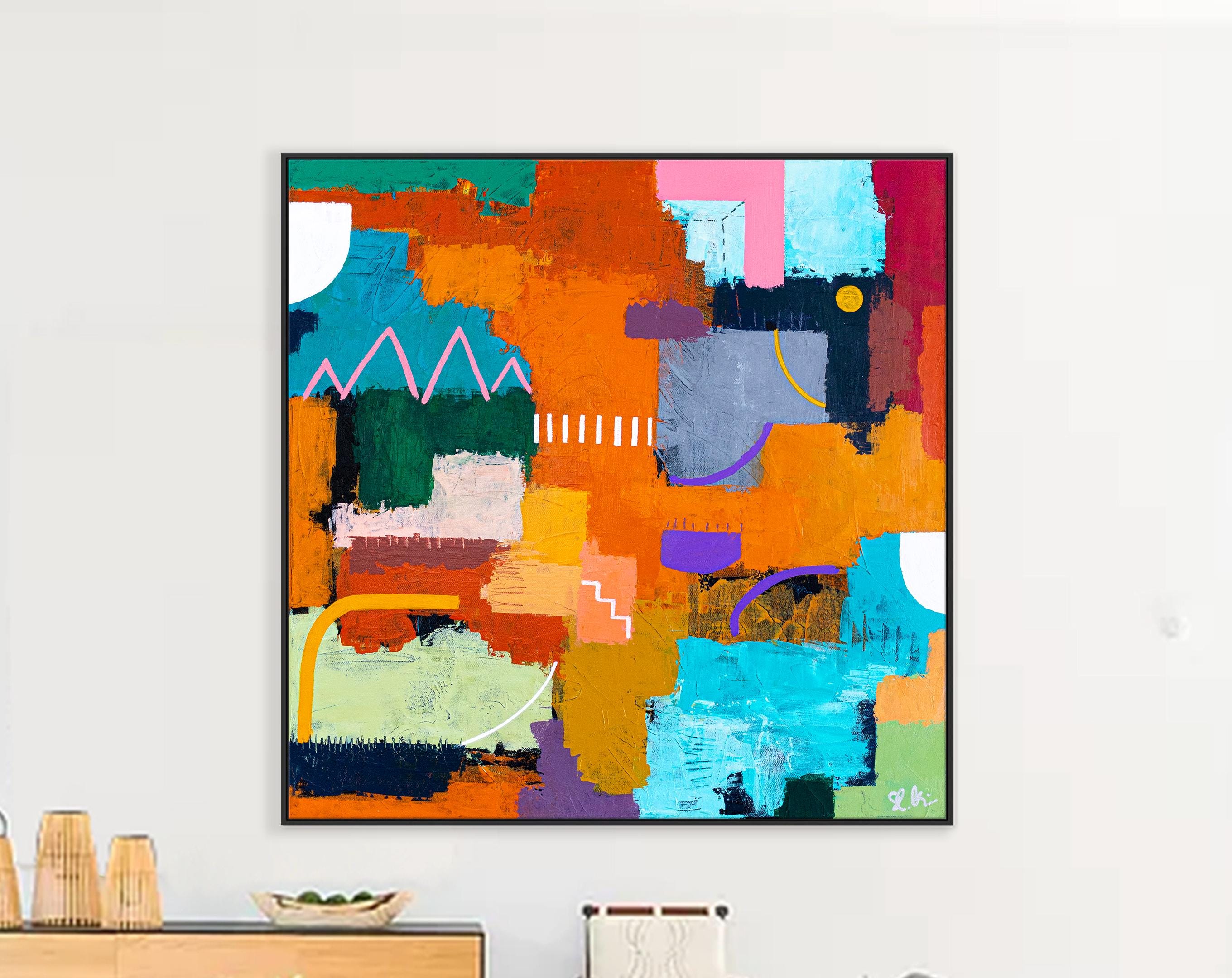
The painting hanging in this contemporary dining room commands attention through its bold geometry and layered color. Vertical in orientation and framed in a slim black profile, it presents a dense mosaic of rectangular and irregular blocks. Dominant reds and deep teals push against warmer oranges, ochres, soft yellows, and cool whites, while darker grays and blacks provide structural anchors. Thick, directional brushwork and visible texture give the surface a tactile, almost sculptural quality. The overall effect is energetic yet balanced, modern yet rooted in mid-twentieth-century abstract traditions.

This work, known as Red Blue Colorful Texture Modern Contemporary Abstract Painting Wp039, exemplifies a popular strand of contemporary abstract painting that merges geometric structure with expressive surface treatment. Hand-painted in acrylic or oil on canvas, it arrives rolled and ready for stretching or framing, with an extra border to facilitate installation. Its large scale makes it especially suited to open-plan interiors where a single strong statement piece can define a wall.
Reading the Composition
The painting’s architecture is built from overlapping planes rather than a single dominant form. A horizontal band of intense red cuts across the middle, acting as a visual fulcrum. Above and below it, cooler teal and blue blocks interlock with warmer yellows and oranges. White and light-gray passages open the surface, preventing the denser colors from becoming oppressive. Black accents appear as thin interruptions or edges, sharpening contrasts without dominating.
Texture is central to the painting’s impact. Impasto layers catch light differently depending on the viewer’s angle and the time of day. Some areas show broad, dragged strokes; others reveal smaller, more agitated marks that suggest the physical process of building the surface. This tactile quality distinguishes the work from flat digital prints or smooth color-field canvases. The eye is invited to travel across the painting, discovering new relationships between color and form with each viewing.
In the dining-room setting shown, the painting hangs against a light neutral wall, allowing its palette to interact with the gray upholstered chairs, dark wood table, and contemporary lighting. The cool blues and teals echo the furniture tones while the reds and oranges introduce warmth that livens the space for conversation and gathering.
Color Relationships and Emotional Temperature
Red and blue form the primary chromatic axis. Red advances and energizes; blue recedes and stabilizes. Their juxtaposition creates a classic “push-pull” effect long discussed in abstract painting theory. Warm secondary notes—orange, yellow, ochre—bridge the two primaries, while neutral whites and grays provide breathing room. The result is a palette that feels vibrant without chaos and structured without rigidity.
This approach recalls the lessons of Hans Hofmann, whose mature paintings combined geometric rectangles of pure color with gestural, textured passages. Hofmann’s concept of push-pull—the idea that color and form can create spatial tension on a flat surface—remains relevant to works like this one. Similar dynamics appear in the broader tradition of Color Field painting, though here the fields are fragmented and overlaid rather than expansive and meditative.
The painting also shares affinities with later geometric abstraction and contemporary practices that treat color blocks as both formal elements and emotional carriers. The absence of literal imagery keeps the focus on pure visual experience: rhythm, contrast, and surface.
Scale and Placement in the Modern Interior
Large vertical formats work particularly well in dining rooms and living areas with high ceilings or substantial wall space. A painting of this scale can balance a long table or anchor a seating arrangement without competing with architectural features. In the example interior, the artwork sits comfortably above the dining zone, its height relating to the room’s proportions and its colors complementing the neutral furnishings.
When selecting size, a useful guideline is that the painting should occupy roughly two-thirds the width of the furniture below it, or leave adequate breathing room on either side if centered on a blank wall. Lighting matters: soft ambient light or directed accent lighting enhances the texture without creating glare on the painted surface. Natural light from nearby windows further activates the colors throughout the day.
Neutral wall colors—soft white, light gray, or warm greige—allow the painting’s palette to remain the focal point. Stronger wall colors can work if carefully matched to one of the secondary hues in the composition, but risk reducing contrast. Furniture and textiles in complementary neutrals or muted versions of the painting’s blues and reds help unify the room.
Why Textured Abstract Work Suits Contemporary Homes
Contemporary interiors often favor clean lines, open space, and restrained materials. A richly textured abstract painting introduces visual and tactile complexity without clutter. It supplies color and movement while remaining non-narrative, so it adapts to changing décor and personal taste. Unlike representational art, which can feel specific to a particular style or era, geometric-abstract works with strong color relationships remain versatile across modern, transitional, and even some eclectic settings.
The hand-painted nature of pieces such as Red Blue Colorful Texture Modern Contemporary Abstract Painting Wp039 adds another layer of value. Variations in brush pressure, pigment density, and edge quality make each canvas unique. Collectors and designers increasingly seek this individuality as a counterpoint to mass-produced décor.
Practical Considerations
Because the painting ships rolled, professional stretching or framing is recommended for a polished installation. Gallery-wrap stretching creates a clean, frameless look; a simple black or natural-wood frame can provide additional definition. The extra border included with the canvas allows flexibility in how the edges are treated.
Care is straightforward: dust with a soft, dry cloth and avoid prolonged direct sunlight that could fade pigments over decades. In high-traffic dining areas, placement slightly above seated eye level protects the surface while keeping the work fully visible.
The Appeal of Bold Color Geometry Today
In an era of digital saturation and minimalist design trends, paintings that combine geometric clarity with physical texture offer a satisfying middle ground. They satisfy the desire for strong visual impact while rewarding closer, slower looking. The red-and-blue axis, supported by secondary warm and neutral tones, creates a versatile emotional register—energizing yet composed, contemporary yet connected to longer traditions of abstract painting.
Whether installed in a dining room, living area, or open-plan loft, a work of this character can transform a wall from background into a defining element of the space. Its success lies not in narrative content but in the precise orchestration of color, form, and surface—qualities that continue to make abstract painting a vital part of modern interiors.
Frequently Asked Questions (FAQ)
Q: What is the style of Red Blue Colorful Texture Modern Contemporary Abstract Painting Wp039? A: It is a contemporary abstract painting that combines geometric color blocks with rich, textured impasto surfaces, drawing on mid-century abstract expressionist and color-field traditions while remaining firmly modern.
Q: What colors dominate the composition? A: Primary reds and teals/blues form the main axis, supported by oranges, yellows, whites, grays, and black accents that create depth and contrast.
Q: Is the painting suitable for a dining room? A: Yes. The bold yet balanced palette complements neutral dining furniture and lighting while adding energy appropriate for social spaces.
Q: How is the painting shipped and installed? A: It ships rolled in a protective tube with an extra border for stretching or framing. Professional stretching is recommended for a clean, gallery-ready presentation.
Q: What wall colors work best behind this painting? A: Soft neutrals—white, light gray, or warm greige—allow the colors to stand out. Stronger wall colors should be chosen carefully to avoid reducing contrast.
Q: Does the textured surface require special care? A: Dust gently with a soft dry cloth. Avoid direct prolonged sunlight and harsh cleaning agents. The surface is durable under normal residential conditions.
Q: Can the painting be customized in size? A: Many versions of this style are available in multiple sizes to suit different wall dimensions and furniture scales.
Q: How does this work relate to historical abstract painting? A: It echoes the push-pull spatial dynamics associated with Hans Hofmann and the structured color explorations of mid-twentieth-century abstraction, updated with contemporary materials and scale.
This painting demonstrates how geometric structure and expressive texture can coexist successfully on a single canvas. In the right setting it becomes more than decoration—it becomes the visual and emotional center of the room.