
How to Select Calming Modern Abstract Art for Your Bedroom Oasis
Your bedroom should function as a true retreat—a space that signals rest the moment you enter. Lighting, textiles, and furniture all play roles, yet the artwork on the walls often determines the emotional temperature of the room more than any other single element. Carefully chosen Modern Abstract Art can quiet the mind, soften visual noise, and support the restorative purpose of the space. The key lies in selecting pieces that feel calm rather than stimulating: soft color, gentle movement, balanced composition, and appropriate scale.
Abstract art, by definition, does not attempt to represent visual reality with accuracy. Instead it relies on shapes, colors, forms, and gestural marks to create its effect. According to the Tate, this approach has formed a central stream of modern art since the early 1900s, offering purity, simplicity, and a kind of visual breathing room that figurative work sometimes cannot. In a bedroom, that freedom from narrative becomes especially valuable. The eye does not need to “read” a scene; it can simply rest.
Color: The Foundation of Calm
Color psychology provides a practical starting point. Cool, muted tones consistently support lower arousal levels. Blue stands out as one of the most reliably calming hues. Research and design guidance associate soft blues with reduced heart rate, a sense of serenity, and even improved conditions for sleep. Green, particularly in muted sage or dusty forms, connects to nature and promotes balance. Warm neutrals—creams, taupes, soft ochres, and warm grays—create a grounded, cocoon-like feeling without visual intensity.
High-saturation reds, oranges, or sharp contrasts tend to raise energy and are better reserved for living or work spaces. In the bedroom, low-contrast palettes that shift gently across the surface of the canvas work best. Think layered washes of misty blue and gray, or tonal variations of beige and soft white. These choices allow the art to change subtly with natural light throughout the day without demanding attention.
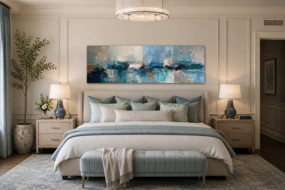
A long horizontal abstract in blues, grays, and soft aqua above a neutral upholstered bed illustrates how cool tones can anchor a restful composition while remaining sophisticated.
Style and Composition: Fluid Over Forceful
Not every abstract piece suits a bedroom. High-energy gestural work with jagged edges, dense mark-making, or strong directional movement can keep the mind slightly alert. Prefer instead fluid, organic forms, soft gradients, blurred edges, and open compositions that give the eye room to wander slowly.
Color-field approaches and lyrical abstraction—broad areas of softly merging tone or gentle, rhythmic brushwork—excel here. Minimalist geometric pieces with limited contrast can also succeed when the shapes remain simple and the palette restrained. Texture adds quiet interest without visual clutter: subtle impasto, layered washes, or matte surfaces catch light differently across the day and give the piece depth.
Horizontal formats often feel especially restful above a bed because they echo the horizontal plane of sleep itself. Vertical works can suit narrower walls or create a sense of gentle upward lift, provided the overall energy stays low.

Soft flowing blues and soft golds on a light ground demonstrate the kind of low-contrast, fluid movement that supports a serene atmosphere.
Scale and Placement: Getting the Proportions Right
Scale mistakes are common and immediately disrupt the calm you are trying to create. Interior designers repeatedly return to a simple guideline: the artwork (or the total width of a coordinated set) should span roughly two-thirds the width of the bed or headboard. For a standard queen (about 60 inches wide), this often means a piece or grouping in the 36- to 45-inch range. King beds call for larger works, frequently 48 to 60 inches or more across.
Height matters equally. Leave approximately 6 to 10 inches between the top of the headboard and the bottom of the frame so the art remains visually connected to the bed rather than floating toward the ceiling. When there is no headboard, treat the top of the pillows as the reference line and hang the piece a similar distance above. The goal is one cohesive composition of bed and art rather than two separate elements competing for attention.
Large single pieces often feel more restful than busy gallery walls in a primary bedroom. A well-chosen pair of matching or complementary works can introduce gentle symmetry without overcrowding. Avoid hanging anything so high that it disappears when you are lying down or so low that it risks being bumped when sitting up.
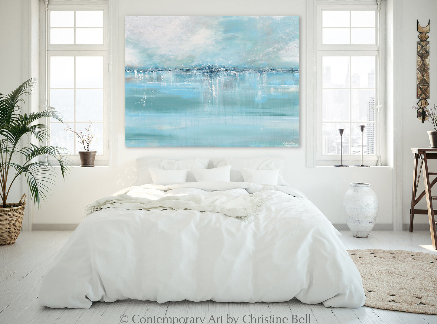
An expansive soft aqua and white abstract above a simple white bed shows how generous scale and cool tones expand the sense of calm in a bright, airy room.
Texture, Materials, and Framing
Texture contributes to the tactile quality of calm. Hand-textured or thickly painted canvases create subtle shadows and surface variation that reward quiet looking. Matte finishes reduce glare under bedside lamps, while gallery-wrapped canvases eliminate the visual weight of heavy frames. When frames are desired, choose simple profiles in natural wood, soft white, or muted metal that recede rather than compete.
Canvas remains the most common and practical support for bedroom art. It is lightweight, shatter-resistant compared with glass-glazed works, and available in custom sizes that solve awkward wall proportions. Many contemporary makers of Modern Abstract Art offer adjustable dimensions so a piece can be tailored precisely to the wall and furniture below it.
Harmonizing with the Existing Room
The strongest bedroom art feels inevitable rather than imposed. Study the dominant colors already present in bedding, walls, flooring, and window treatments. The artwork can echo those tones or introduce a related cool or neutral accent. Soft lighting—warm bedside lamps or dimmable overheads—reveals texture and subtle color shifts without harsh contrast.
Personal response remains the final filter. Spend time with candidate pieces if possible. Notice whether the work leaves you feeling quieter or slightly more activated. In a bedroom, the former is almost always the better outcome. A piece that feels peaceful on first viewing and continues to feel peaceful after weeks of living with it has succeeded.

Soft pastel horizon abstracts in muted pinks, beiges, and pale blues offer another route to calm, evoking distance and quiet light without literal scenery.
Practical Considerations and Sources
Quality materials and construction matter for longevity and safety. Look for well-stretched canvases, stable paint layers, and secure hanging hardware rated for the weight. Professional makers who specialize in larger-scale abstract work often provide custom sizing and finishes suited to residential use.
When selecting, prioritize authenticity of palette and surface over trend-driven novelty. The most enduring bedroom pieces tend toward restrained color, thoughtful composition, and materials that age gracefully. Sites dedicated to oversized and textured abstract work make it easier to find options already oriented toward calm residential settings.
A well-chosen abstract painting does not merely decorate the wall above the bed. It participates in the daily ritual of winding down and waking up. By favoring soft color, gentle form, correct scale, and personal resonance, you create an environment that supports rest rather than competing with it. The result is a bedroom that feels like an oasis—quiet, coherent, and quietly restorative.
FAQ
What colors work best for calming abstract art in a bedroom? Soft blues, muted greens, warm neutrals (cream, taupe, soft gray), and low-contrast tonal combinations. These hues support lower visual intensity and align with color-psychology findings on reduced arousal.
How large should art above the bed be? Aim for roughly two-thirds the width of the bed or headboard. Queen beds often suit 36–45-inch-wide pieces or groupings; kings generally need 48 inches or more. Scale slightly larger rather than smaller if the wall allows.
Should I choose one large piece or a set? A single well-proportioned piece usually feels calmer and less busy. Coordinated pairs or triptychs can work when spacing is generous and the overall energy remains low-contrast.
Is textured abstract art suitable for bedrooms? Yes. Subtle texture adds depth and tactile interest without introducing visual noise. Matte or softly glazed surfaces perform especially well under bedroom lighting.
Can abstract art help with sleep or relaxation? While art alone does not guarantee better sleep, low-contrast, soft-palette abstracts reduce visual stimulation and support the mental shift toward rest. They function as part of a broader calming environment.
Where can I find quality modern abstract options for larger bedroom walls? Specialist galleries and makers focused on oversized and custom-sized abstract canvas work, including collections of neutral and soft-toned pieces designed for residential spaces such as those available at extralargewallart.com. Always confirm dimensions, materials, and return policies before purchasing.