
Abstract Wall Art: Meaning, Style, and How to Choose It for Your Home
Abstract Wall Art is one of the few kinds of painting that can finish a room without telling a story. It does not depict a coastline, a face, or a still life. It works through color, shape, scale, and surface. That is why it has become the default language of so many contemporary interiors: it can set a mood without locking the room into a single narrative.
Tate defines abstract art as work that “does not attempt to represent an accurate depiction of a visual reality but instead uses shapes, colours, forms and gestural marks to achieve its effect.” Britannica puts it more bluntly: portrayal of things from the visible world plays little or no part. Those two sentences explain both the freedom and the difficulty of living with abstraction. There is no subject to “get.” There is only the painting, the wall, and the people who sit in front of it.
From Pure Form to the Living Room Wall
Abstraction is older than the word “modern.” Decorative geometry and symbolic pattern appear across cultures for centuries. What changed in the early twentieth century was the claim that a painting could be complete without describing anything at all.
Wassily Kandinsky, Robert Delaunay, Piet Mondrian, and Kazimir Malevich are among the names most often cited as pioneers of that shift. Hilma af Klint’s earlier non-objective work has also revised the standard timeline. Kandinsky’s canvases of intersecting circles, lines, and floating planes treated color as if it could behave like music. Mondrian reduced the world to primary colors and a grid. Malevich’s Black Square proposed that a single geometric form could stand as a new kind of image.
After the Second World War, abstract expressionism gave abstraction a different temperature. Action painters such as Jackson Pollock and Willem de Kooning treated the canvas as a field of events—drips, slashes, and physical marks. Color field painters such as Mark Rothko, Barnett Newman, and Clyfford Still used large, relatively quiet areas of color intended to produce a contemplative response. Both tendencies still shape what people hang above a sofa today: one lineage is energetic and tactile; the other is atmospheric and slow.
Those museum histories matter at home because they explain why abstract wall art feels durable. It is not tied to a fashionable subject. It is tied to visual structure.
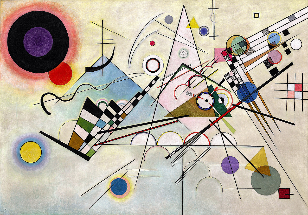
Kandinsky’s Composition 8 (Solomon R. Guggenheim Museum) shows how geometry, color, and line can carry a painting without a recognizable scene.
What Abstract Wall Art Actually Does in a Room
Designers return to abstraction for practical reasons, not only theoretical ones. A landscape tells you where you are looking. A portrait tells you whom you are looking at. An abstract painting tells you how the room should feel.
Color does most of that work. Cool fields of blue, slate, and muted green tend to quiet a space. Warm ochres, rusts, and golds add heat. High-contrast black-and-white or navy-and-gold compositions add structure. The mistake is to treat the painting as a color chip. A canvas that exactly repeats the sofa often looks coordinated and then goes dead. A stronger approach is to share one or two undertones with the room and introduce one element the room does not already have—heavier texture, a cooler accent, or a sharper geometric edge.
Scale is the second function. A small painting on a large living-room wall reads as leftover. A single large canvas, or a grouping planned as one visual unit, can anchor seating the way a fireplace once did. The common guideline is that art above a sofa should span roughly two-thirds to three-quarters of the furniture’s width, with a gap of about six to twelve inches between the sofa back and the bottom of the work. The center of the piece often sits near average eye level, around 57 to 60 inches from the floor, though the relationship to the furniture matters more than a rigid number.
Texture is the third function, and it is easy to underestimate until the painting is on the wall. Impasto ridges, scraped passages, and layered glazes catch changing light. In rooms full of glass, stone, and smooth upholstery, that physical surface is often what keeps the wall from feeling flat.

A single large, quietly composed canvas can organize a seating area more cleanly than a cluster of small frames.
The Main Languages of Contemporary Abstraction
Not all abstract wall art speaks the same dialect.
Gestural work emphasizes the mark. You see the sweep of a knife, the drip of a loaded brush, the collision of wet layers. It introduces movement into rooms that are otherwise orderly.
Geometric abstraction uses planes, bands, circles, and hard or near-hard edges. It pairs well with architecture that already has strong lines—steel windows, grid ceilings, rectilinear sofas.
Color field and atmospheric work relies on large areas of hue with soft transitions. These paintings often look simple from across the room and more complex at close range.
Minimal and tonal abstraction reduces incident. Beige, gray, off-white, and quiet earth colors carry the piece. Texture or a single dark bar may be the only “event.” These works are useful in rooms that already have a lot of pattern or furniture.
Textured and mixed-media surfaces push the painting toward relief. Modeling paste, heavy acrylic, or oil built in layers creates actual shadows. The painting changes as daylight moves.
None of these is automatically more “serious” than the others. The right language is the one that answers the room: counterpoint if the furniture is rigid, calm if the furnishings are already busy, warmth if the architecture is cool.
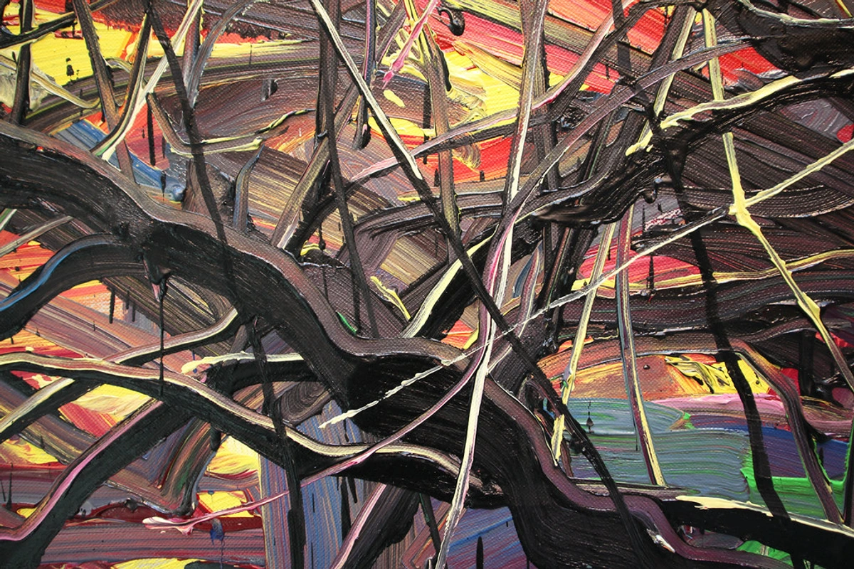
Close looking reveals why surface matters: gesture and thickness become part of the image, not just a way of applying color.
Choosing with the Room First
A reliable sequence is mood, then scale, then color, then surface.
Start with how the room is used. A living room that hosts conversation can take a stronger field and more contrast. A bedroom usually wants mid values and less glare. A home office benefits from a surface that will not flare on camera.
Then measure. Note sofa width, wall width, ceiling height, and viewing distance. Horizontal formats often suit sofas; vertical formats help tall walls and narrow piers; squares can stabilize an L-shaped sectional.
Then look at materials already in the room—oak, linen, stone, black metal, warm plaster. Abstract paintings that borrow one of those temperatures usually sit more naturally than paintings chosen only from a catalog thumbnail.
Finally, consider light. Raking light from a side window or a picture light will reveal texture. Even, frontal light will flatten it. Warm-white lamps in the 2700–3000K range generally flatter both earth palettes and cooler abstracts.
Handmade canvas work still has an advantage here. Slight irregularities, layered edges, and variation in sheen are what keep a large painting from looking like a graphic applied to the wall.
Living with Abstraction Over Time
One reason abstract wall art lasts is that it does not expire when a trend in figurative subject matter changes. A coastal scene can look dated when the rest of the house moves on. A well-scaled field of color and mark can survive new pillows, a different rug, even a change of sofa, provided the temperature of the painting still belongs to the architecture.
That does not mean every abstract painting is interchangeable. A high-chroma geometric piece and a dusty, scraped earth painting will produce two different rooms. The discipline is to choose the character first and the product second.
The best installations feel inevitable after a week: the painting is not shouting, and the wall no longer looks empty. That is the quiet test of abstract wall art—not whether it matches a swatch, but whether the room feels complete when you sit down.
Frequently Asked Questions
What is abstract wall art?
It is wall-based painting or mixed media that uses color, form, line, and texture rather than a recognizable scene. Meaning comes from visual structure and atmosphere, not from depicted objects.
Why do interior designers use abstract art so often?
It sets mood without dictating a story, pairs easily with contemporary furniture, and can supply color or texture that the architecture lacks.
How large should an abstract painting be above a sofa?
A useful range is two-thirds to three-quarters of the sofa’s width. A piece that is much narrower often looks stranded.
Should the colors match the sofa exactly?
Usually no. Share one or two tones with the room and let the painting introduce contrast, texture, or a slightly different temperature.
What is the difference between gestural and geometric abstract art?
Gestural work emphasizes visible marks and movement. Geometric work emphasizes planes, edges, and structured relationships. Both can be contemporary; they simply counterbalance a room in different ways.
Is abstract art only for modern interiors?
No. A quiet tonal abstract can soften a traditional room, and a more energetic canvas can keep a historic interior from feeling like a period set.
How should abstract wall art be lit?
Use raking or slightly directional light so texture and layered color remain visible. Avoid harsh glare that turns the surface into a mirror.
Does abstract art go out of style?
Individual palettes trend, but the underlying idea—color and form without a required subject—has been central to modern art for more than a century and remains one of the most adaptable choices for the home.